
How does a website make a good first impression?
Why Responsive Web Design is Essential for Business Growth
Let’s face it: your website is often the first impression people get of your business.
And with everyone browsing the internet on their phones these days, it’s more important than ever to make sure your site looks good on any device. That’s where responsive web design comes in. It’s all about creating a website that automatically adjusts to any screen size, whether it’s a desktop, tablet, or smartphone.
Smooth Experience for Everyone, Everywhere
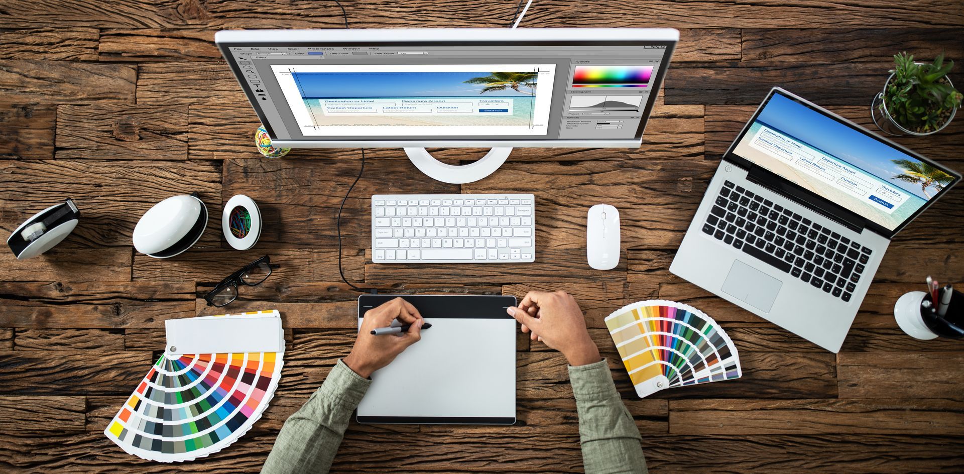
With responsive web design, your website adapts to any device. No zooming, no weird squishing, and no need for any gymnastics to get everything to fit on the screen! Whether someone’s on their laptop or phone, your site will look sharp and be easy to navigate.
Why this matters: When people can easily use your site, they’re more likely to stay longer, explore more, and, of course, become your next customer. Your website will be as flexible as a yoga instructor on a beach vacation. Namaste, conversions

Google Loves It (And So Should You)
Google’s got your back—kind of. If your website is mobile-friendly, it’ll rank better in search results. Google uses mobile-first indexing, which basically means they look at your mobile site first to decide where to place you in search results.
Why this matters: More visibility = more traffic = more chances to win new customers. Think of it like getting a five-star rating from Google. Pretty sweet, right?
Save Time and Money (Really!)
In the past, businesses had to create separate versions of their websites for desktop and mobile. Double the work, double the headaches, and let’s face it, who has the time? With responsive web design, you get one website that works everywhere. No extra costs, no extra stress.
Why this matters: You save time and money. You’ll feel like a genius who just found the “easy” button. Now you’ve got more resources for things like pizza Fridays and new marketing ideas!
More People Are Browsing on Phones
Let’s be real: the majority of people are browsing the web from their phones now. If your website isn’t mobile-friendly, you’re basically saying, “Sorry, no room for you on my site.” Not cool.
Why this matters:
Responsive web design makes sure you’re not shutting out all those mobile users. It’s like offering free snacks at a party—everyone loves it. The more mobile-friendly your site, the more people will “RSVP” to your business.
Boost Your Conversion Rates
When your site looks great and works smoothly, customers are more likely to take action. Whether that’s signing up for your newsletter, filling out a contact form, or making a purchase, responsive design is like the magic sauce that gets people to do what you want.
Why this matters:
A user-friendly site = more sales, leads, and opportunities. It’s like a one-size-fits-all jacket—but, you know, in website form. And it fits every customer perfectly!
Stay Ahead of the Game
The web is constantly changing, and so are the devices people use. With responsive web design, your site will adjust to new screen sizes and tech without you having to hit the reset button every time. It’s like giving your website a time machine that keeps it looking fresh!
Why this matters:
You won’t need to worry about redoing your site just because new gadgets hit the market. You’re future-proofing your business, and your website will be ready for whatever comes next—like a website chameleon changing colors to blend in.
Track Everything in One Place
If you’re using separate sites for desktop and mobile, you’re probably tracking them separately too. Double the work, double the data headaches. With responsive design, all your traffic data is collected in one spot, making it easy to track what’s working and what’s not.
Why this matters: Better data = better decisions. It’s like getting a map to your business’s treasure chest. And who doesn’t want treasure?
Show Your Competitors Who’s Boss
Still relying on an old, outdated website? Your competitors are probably already using responsive web design to their advantage. Don’t get left behind! A responsive site shows that your business is modern, professional, and knows what’s up.
Responsive web design isn’t just a “nice-to-have” anymore—it’s a must for business growth.
It makes sure your site works on any device, boosts your search rankings, saves you time, and helps you stay ahead of the competition.
So, let’s get your website to adjust like a pro!
At TechXpress, we specialize in creating responsive websites that are as stylish as they are functional. Reach out today, and let’s make sure your site fits every screen, every time.


